The style that is in right now for show home or interiors photography is sunlight…
Black and White Photography Is Not Just Absence of Colour
Black and white photography has always been in, but as of late, the style has exploded. It’s very easy now to snap a photo with your cell phone and then use an editing app to crop to a square photo, use a black and white filter, then upload to social media.
What I’ve learned over the years is when you’re deciding to take a photo with the intention of making it black and white, you have to ask youself what features you want to showcase in the subject. On the computer, there’s pre-installed apps on the PC where you can do very minimal photo editing and turning a photo to black and white is one of them. The issue you run into is that the app is not sophisticated enough to do anything more than remove colour from the photo. In order words, it’s just a photo that has the absence of colour, therefore, appearing to be black and white. Most of the time, it just ends up looking dull.
In the professional photography world, there are a few key applications that are used for photo editing that has many more features than the free one that is installed on your PC. Those being Aperture by Apple, Photoshop and Photoshop Lightroom (commonly referred to as Lightroom) by Adobe. Prices range from $79 to $149 to you don’t want to know. Aperture and Lightroom are the easiest to use and produce great photo editing and enhancement results.
Let me show you some examples of the results between turning a photo simply to black and white, and then using more flexible software to achieve results that showcase more of the subject in the photo and give it that wow factor. The top photo is the ‘before’ simple black and white, and the bottom photo is the ‘after’ with changes and editing made like increasing/decreasing brightness, contrast, clarity, and foreground lighting.
*Before we begin, I want to note some photography editing terms:
Brightness: the amount of light in the photo. Too much can wash out any photo or be overbearing, so you’ll need to find the happy medium using the slider on any photo editing program.
Contrast: the range of light and dark in the photo. Simply put, changing the contrast will make the bright regions brighter, and the darks, darker.
Clarity: the amount of detail in the photo. When editing, you can diffuse, or decrease clarity or you can increase the clarity to show more detail.
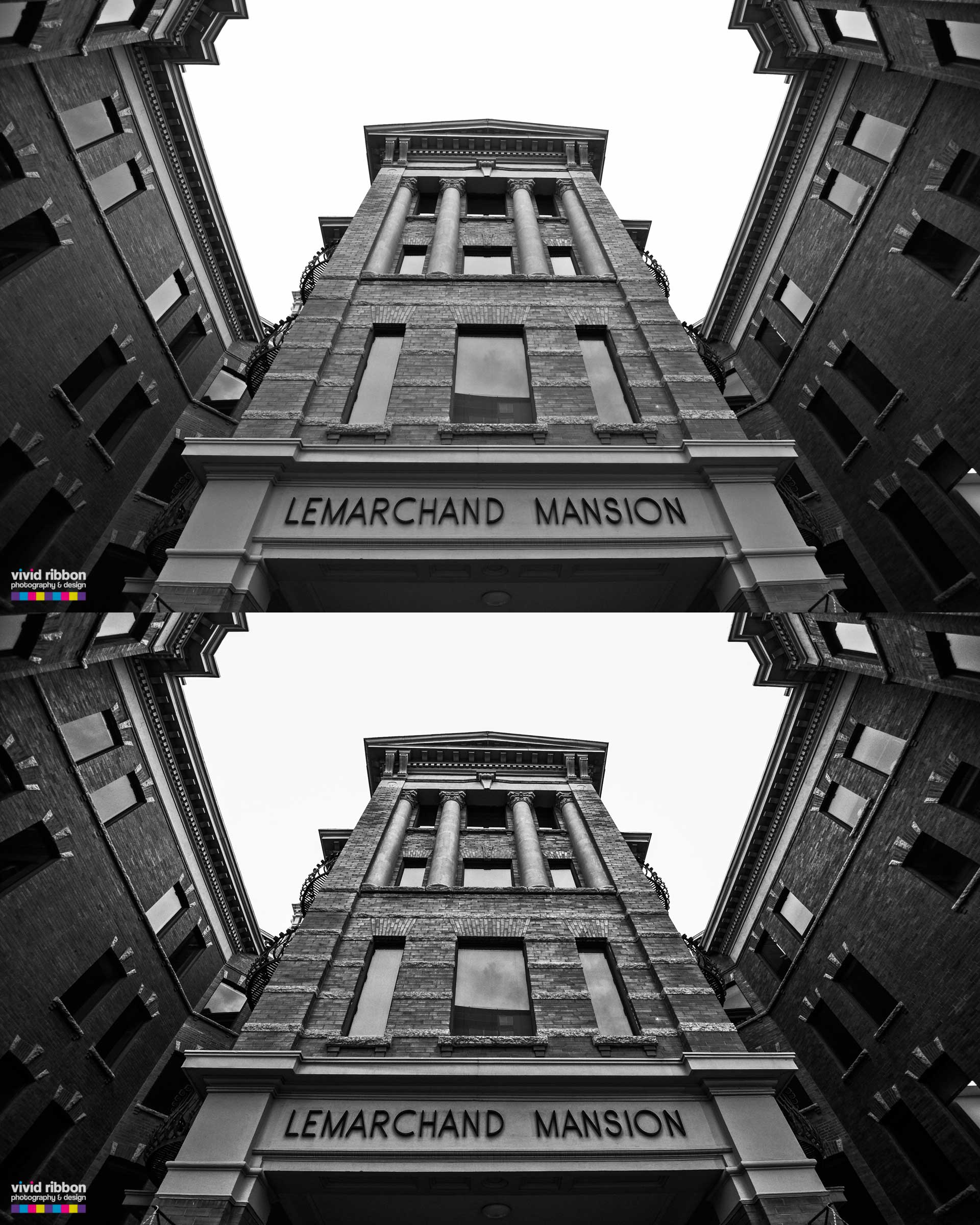
Example 1: LeMarchand Mansion, Edmonton, Alberta.
This building is a historical building in Edmonton, built in the early 1900’s and simply turning the photo to black and white does not do it justice. It has features that need to be showcased more such as the bricks on the building or the pillars. By changing the sliders for brightness, contrast, and clarity, I was able to bring out more of the building’s character, that was lacking in the Top photo. Can you see the huge difference? (Click for larger preview).
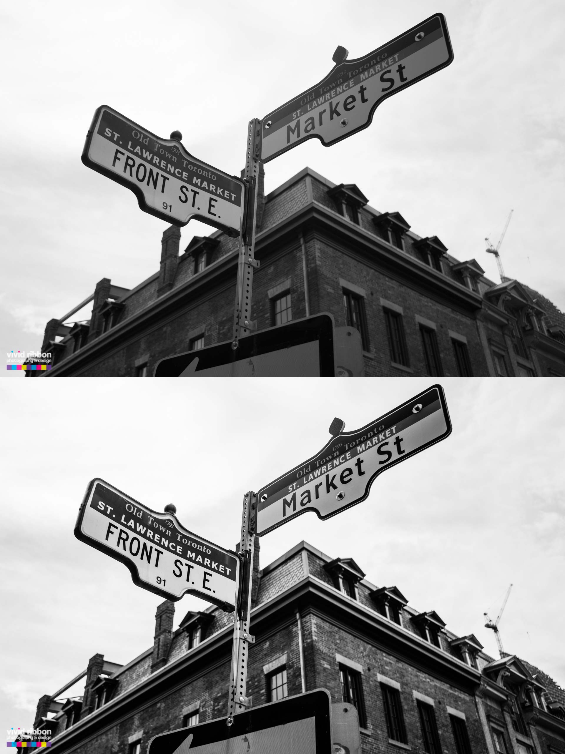
Example 2: Front Street Signs, Toronto, Ontario
This particular area of Toronto is also quite old and I wanted to showcase the street signs more, as well as the bricks on the building in the background. By changing the foreground lighting, or shadows slider in Lightroom, I was able to increase the foreground lighting in the photo to brighten the signs. This is something a basic program would not be able to do.
Notice how the building comes to life more by being able to see the highlights on the building, drawing your eyes to the lines on the building. By increasing the clarity slider, I was able to bring out the detail on the building, allowing the viewer to see the bricks more and overall, the letters on the signs are clearer. The result is that it gives the photo more of a ‘punch’. (Click for a larger preview).
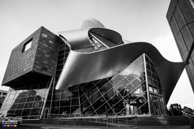
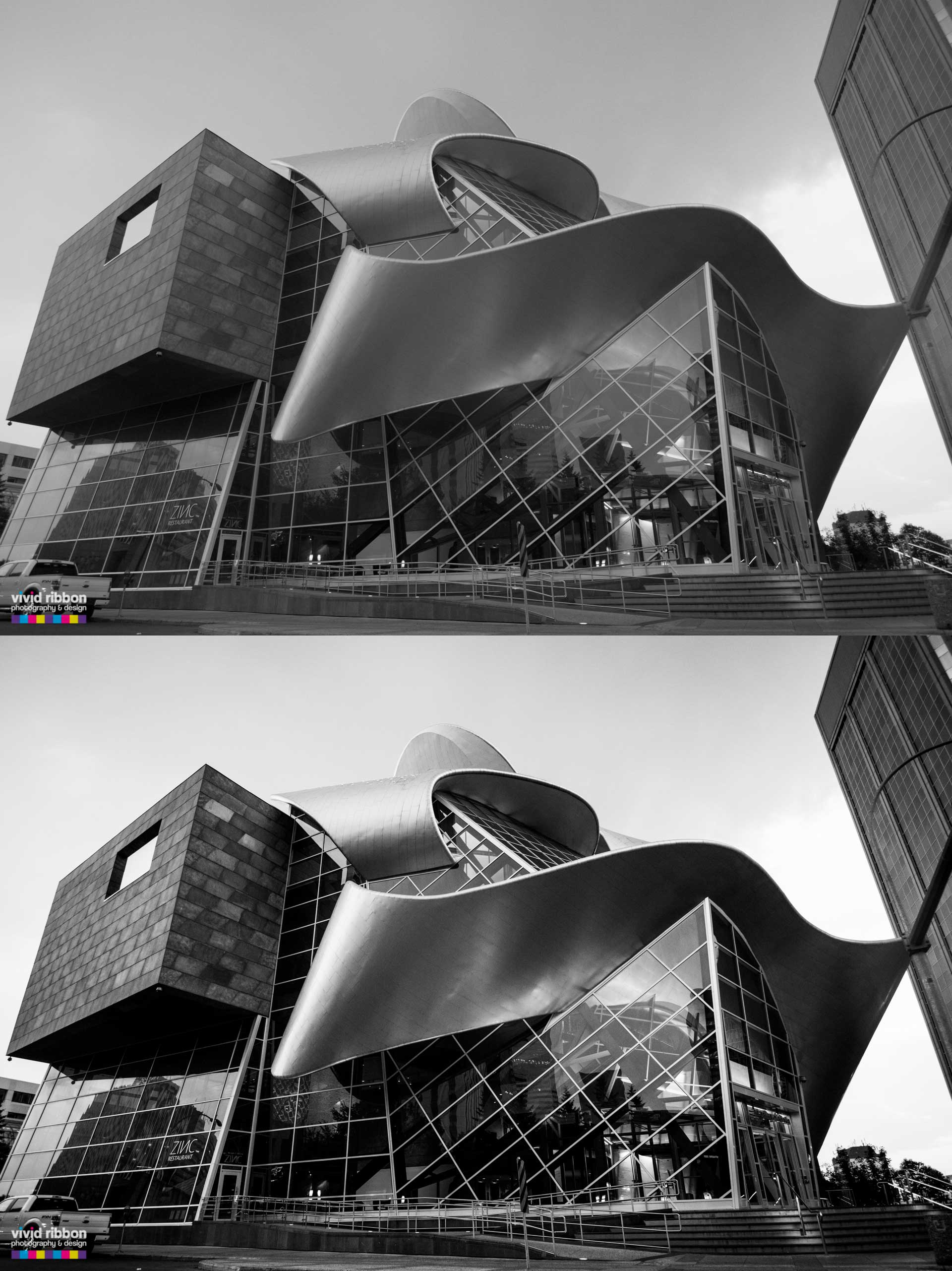
Example 3: Art Gallery of Alberta, Edmonton, Alberta.
I have to say this building is one of the most unique pieces of architecture I have ever seen. It’s an iconic landmark in Edmonton and deserves to be presented as such.
As you can see, the top photo is quite dull in it’s current state. This building features metal, glass, zinc panels etc. and it’s hard to see the real beauty by just leaving it as a simple black and white photo.
By increasing the brightness, clarity, and contrast slightly, the result is outstanding. You can actually tell now that the curved metal has a shine to it as the light from inside the building is reflecting off of it. All the lines on the building come to life more now and this also does the glass work in the front some real justice to its beauty. Definitely more captivating now!
Conclusion:
This past week, a Twitter user was asking if it was worth it to purchase Aperture with her Mac computer and the answer is yes! For $79, you can have this program forever and use it to edit or enhance as many photos as you want. Both Aperture and Lightroom are really easy to use, even for beginners, and all it takes is a creative eye and using some editing sliders to increase or decrease certain features you want to incorporate.
If this was helpful to you, please share! If you have any questions, please post below.
Here is a shortened URL for sharing! http://vrbn.ca/1k9elnx
About Vivid Ribbon Photography & Design: We specialize in Commercial, Architecture, Event, and Portrait Photography, in Edmonton, Alberta, with a focus on helping businesses promote their product or service through creative and captivating photography. We produce photos and creative artwork that are in alignment with our client’s current marketing and branding strategies.
![]()
Related Posts

Comments (0)